
Using visual aids in an elearning course is an excellent way to ensure learners stay engaged and comprehend the material presented. But what if the data is too complicated with too many numbers and categories? To effectively communicate a difficult concept in an elearning course, you can use infographics for visual content presentation. Visualizing the data with elearning infographics is invaluable for custom elearning development because it allows you to present complex information in the form of charts, symbols, lists, images, and other visual elements. These elements can help you explain a complex topic, present the data in a clear way, demonstrate similarities and differences, show magnitudes, present progress, explain the rate of change, etc.
This article will provide a complete guide to using infographics in elearning. Feel free to read the entire guide or use the link below to jump to a section of your interest:
The Benefits of Using Infographics in eLearning
Tips to Get Started Using Infographics in eLearning
Components of a Good eLearning Infographic
Storytelling with Infographics: Let the Data Tell the Story
The Types of eLearning Infographics
When You Should Use eLearning Infographics
Visual Design for an eLearning Infographic
Evaluating Your Infographic Design
The Benefits of Using Infographics in eLearning
So should you or should you not use infographics? In most cases, a well-designed infographic does prove to be beneficial in presenting data. There are many reasons why the elearning content presented as an infographic is generally highly effective in teaching the concept. Here are some of them.
Visuals get 94% more views than text-based information!

A well-designed infographic can provide more views and more user engagement. A learner may be overloaded with all the information already presented in a learning course. If you visualize some of the data, it gives the learner a break from the text/audio and provides a fresh stimulus to pay attention. On the biological level, the human eye is naturally drawn to visuals. And you can use this fact to your advantage by adding infographics to your elearning course.
Human brains process visuals 60 times faster than text!
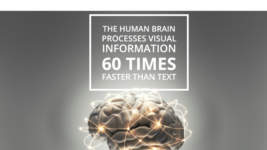
It’s been known for a long time that a human brain processes more information if it’s presented in a visual format. In fact, the visual data is processed 60 times faster than the text. This means that the knowledge you present as an effective infographic will be processed much faster by the learner’s brain.
Visuals increase retention of information by 42%.
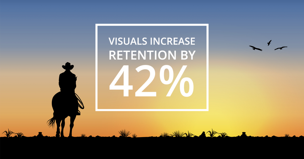
In many studies, experimental psychologists and educators have found that retention of information three days after a meeting or other event is six times greater when information is presented by visual and oral means than when the information is presented by the spoken word alone.
Studies by educational researchers suggest that approximately 83% of human learning occurs visually, and the remaining 17% through the other senses – 11% through hearing, 3.5% through smell, 1% through taste, and 1.5% through touch.
The studies suggest that three days after an event, people retain 10% of what they heard from an oral presentation, 35% from a visual presentation, and 65% from a visual and oral presentation.
Tips to Get Started Using Infographics in eLearning
- Build the infographic around data, not the other way around
- Focus on the message you want to convey
- Describe your message in a single sentence, this can be the main takeaway
- Decide on how you will organize the information
- Outline the structure of the infographic
- Write out the main ideas for the infographic
- Map out how the main ideas will tell a concise story
- Decide which data are more important and what information the learner needs to know
- Sketch out the infographic to see how all elements will come together
- Focus on telling a story with the infographic
Components of a Good eLearning Infographic
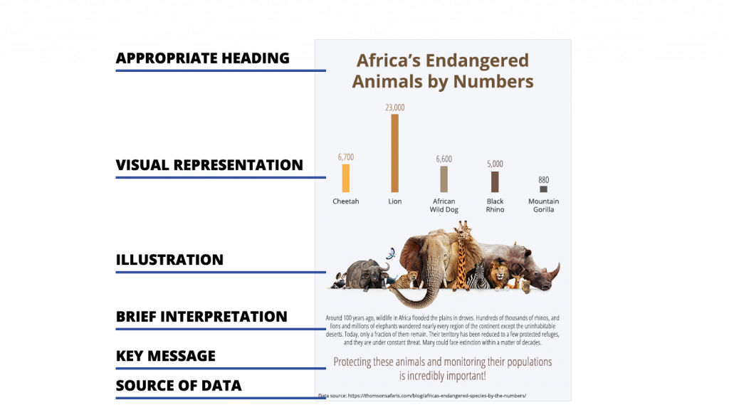
A useful infographic will be comprised of the following parts:
- An appropriate heading clearly stating the topic of your elearning infographic.
- A visual representation of data in the form of charts or graphs. The goal when creating the data representation is to draw attention to the numbers/values/magnitudes while simultaneously making it easier for the learner to understand and remember the content.
- Images and illustrations representing the subject of the infographic.
- A brief interpretation that highlights the main message of the elearning course that’s being demonstrated by the infographic.
- Key message or call to action. A short explanation or summary of the material presented in the infographic.
- Source of the data used.
Each of these components is shown in the image below. Notice how, together, the 7 components tell a complete story of the infographic.
Storytelling with Infographics: Let the Data Tell the Story
In an effective infographic, every data point, visual object, and design element supports the core story. Here’s how you can make sure your elearning infographic tells a compelling story and keeps the learners’ attention along the way.
1. Attract attention with an interesting title and captions.
Titles and subtitles are easy ways to draw attention to the infographic because they’re what people tend to scan first. Make sure your titling is relevant to the data and fits the story you’re trying to tell by visualizing the data. Note that it’s important to use clarity and specificity when writing a title. A punchy title is key for drawing in viewers but going overboard can be very distracting and detrimental to the learning process.
2. Provide context for the data.
Data is a great storytelling tool, but you also need to highlight the significance and meaning of the data the learners are looking at. Consider who will be reading your infographic, what their knowledge level is, and what additional content can make the data visualization impactful, clear, and understandable. If you have multiple data visualizations in a single infographic, use text to tell that story clearly and draw the connection between various pieces of data. In the case of a single dataset, one explanatory paragraph is often all you need.
3. Guide the learner through the logical hierarchy.
Organizing your content in a logical and concise way is essential. For effective storytelling, an infographic should contain any necessary background information to give context to the data. The story should move through the data intuitively. It’s also helpful to structure and design content modularly. This helps you organize your thinking and makes it easy for the eye to process single panels one at a time.
4. Highlight notable story findings/insights.
The goal of the infographic is to convey a clear and specific story, so it’s important to directly call out key takeaways. While you may have a clearly defined story or message, your tone should remain analytical, not opinionated. The interjection of opinion makes for a clear bias, which calls into question the integrity of the data being presented.
5. Provide a sound conclusion.
Once you’ve presented your story with the visual data, you want the learner to understand the conclusion of the story. It’s important to offer some sort of summary, solution, or recommendation that speaks to the data presented in the infographic.
If you would like to learn more about the science of storytelling, watch the video below. In it, Prasad Setty, the Vice President of People Analytics and Compensation at Google, explains how good communication boils down to three things that matter: what you want your audience to know, how you want them to feel, and what you want them to do. While data and science may lead the content, he reminds storytellers of the importance of using emotion in communication. These concepts are also applicable to elearning and digital learning settings.
The Types of eLearning Infographics
The elearning materials can be presented in a variety of infographic types and their combinations. Below are the most common types used in elearning courses.
Mixed charts
As the name implies, this type of infographic incorporates different chart and graph formats. This mixed set of charts and graphs is the best option when you have various data, statistics, facts, and figures to communicate to your audience.

Informational / List Infographics
Another common type of infographic is the list-based or informational visual. This type of long-form presentation is composed mostly of text and does not rely too much on graphs, charts, or other visual elements. While the information is enhanced with an attractive color scheme and icons, overall, the words drive the message home.

Timeline
Whenever you want to show how something has evolved over time or want to tell a story in chronological order, this type of infographic is the most useful in getting your point across. Timelines are most effective when they incorporate many different data points spread out across time and are accompanied by images, icons, and other graphic elements.

How-to infographics
This type of infographics shows the steps involved in doing or creating something. This format is best suited for visualizing how-to elearning content and the description of the procedures that consist of multiple steps to follow.

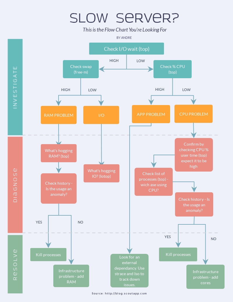
Flow chart or a decision-tree
Although this visual format may seem similar to the previous one, it is different in the sense that it refers specifically to the description of a process. This type of data visualization provides a good overview of a particular process.
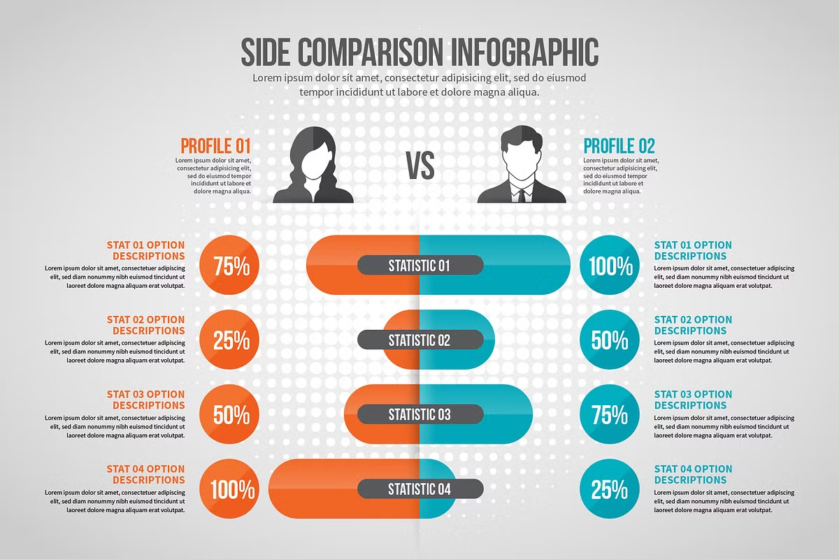
Comparison Infographics
Another common use for infographics is making comparisons between two statistics, products, people, ideas, things, etc. Besides comparing two data points side-by-side, it can also be used to visually contrast and compare seemingly opposing things to reveal similarities, differences, and relative advantages.
Location
One of the easiest ways to visually communicate trends across a region–local, national, or global–is to use a location infographic. Usually in the form of a map with icons and color-coded regions, this type of visual is ideal for comparing regional and global statistics on a relevant subject in an elearning course.

Photographic infographics
A photographic infographic or an “image-based infographic” is what results from the combination of images with graphic elements such as simple line charts, icons, or text. Just like you do with any elearning course visuals, you should use high-quality images for this type of data presentation. A well-thought-through photographic infographic is aesthetically pleasing and catches the eye because of the way it creatively combines disparate visual formats.

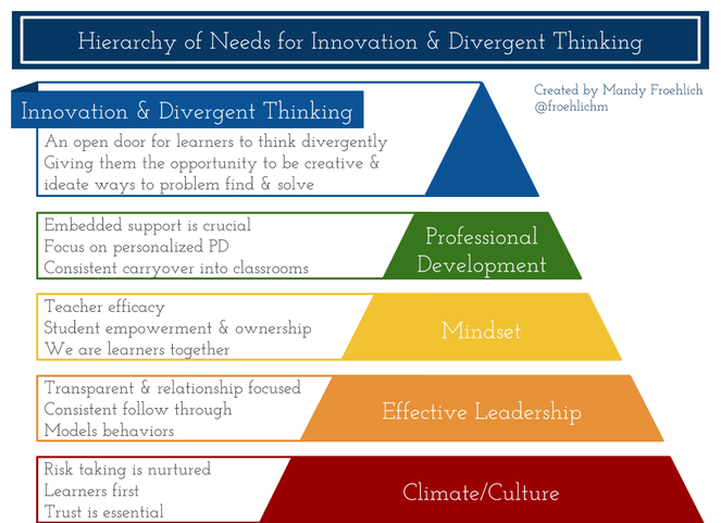
Hierarchical infographics
These infographics organize information according to levels–whether it be level of importance, level of difficulty, income level, etc. Although most commonly seen in the shape of a pyramid, this type of infographic can also be seen in the form of an organizational chart. The key function of this type of visual is to compare the different levels and show the order and relationships between each of them.
Single chart
As the name implies, single-chart infographics simply use one chart type as the focal point of the data visualization. In comparison with mixed-charts infographics, this one is capable to focus the learner’s attention on a single set of indicators or data points. Single elearning chart infographics are often easy to understand, simple, and not very text-heavy. This type of infographics is one of the most commonly used in elearning courses for data presentation and data visualization.
Visualized numbers
These kinds of infographics present various statistics and figures visualized using large numbers, icons, or other graphic elements. This type of infographic is ideal for adding visual interest to individual data points or bits of information.

When You Should Use eLearning Infographics
Some data are more appropriate for elearning infographics than others. Here are examples of situations when it is best to present data with infographics.
Inform about the data
This is the most basic infographic type. Use it when you have a data point that you want to illustrate in an elearning course. This infographic works well when you need to convey a single important message or data point that does not require much context to understand.
The best charts to convey a single message are single big number, pie chart, donut chart, pictograph.
Visualize trends over time or space
Such infographics can contain a timeline of events that helps learners figure out the relationship between various incidents as they occur over a specific span of time. Another example would be a chart demonstrating how a single variable changed over time.
The best charts to show change over time or by location are line chart, area chart, timeline, map chart.
Compare and contrast data
This type of infographic features similar items placed side-by-side, so making a comparison is easy. Naturally, it works best with data categories that have similar features.
The best charts to compare categories or show compositions are bar chart, bubble chart, pie chart, stacked bar chart, bubble cloud, treemap, word cloud.
Organize data and reveal relationships
You can use infographics to help learners understand the relationship between events across time, space, or categories. Infographics that show groups, patterns, rank, or order can help the learners to make sense of the elearning content.
The best charts to show correlations among variables or values are scatterplot, histogram, multi-series chart.
Explain a process
These Infographics let you break down complex processes into their simpler components and represent them visually and sequentially for easy understanding. The technical subject matter can often be best expressed using an infographic.
The best charts to explain a process are timeline, flowchart, pyramid, table.
Organizing Infographics Data
An impactful infographic should have the data organized in a clear and logical way to make it easy for the learner to understand the point you are trying to convey. In most cases, the data used in the infographic can be organized by location, alphabet, time, category, or hierarchy
Organizing by location
Location is the natural form to choose when you are trying to examine and compare information that comes from diverse sources or locales. If you were examining an industry, for example, you might want to know how it is distributed around the world. Doctors use different locations in the body as groupings to study medicine.
Organizing by alphabet
This method lends itself to organizing extraordinarily large bodies of information, such as words in a dictionary or names in a telephone directory. As most of us have already memorized the twenty-six letters of the alphabet, the organization of information by alphabet works when the audience or readership encompasses a broad spectrum of society that might not understand classification by another form such as category or location.
Organizing by time
Time works best as an organizing principle for events that happen over fixed durations, such as conventions. Time has also been used creatively to organize a place, such as in the Day in the Life book series. It works with exhibitions, museums, and histories, be they of countries or companies. The designer Charles Eames created an exhibit on Thomas Jefferson and Benjamin Franklin that was done as a timeline, where the viewers could see who was doing what, when. Time is an easily understandable framework from which changes can be observed and comparisons made.
Organizing by category
Category pertains to the organization of goods. Retail stores are usually organized in this way by different types of merchandise, e.g. kitchenware in one department, clothing in another. Category can mean different models, different types, or even different questions to be answered, such as in a brochure that is divided into questions about a company. This mode lends itself well to organizing items of similar importance. A category is well reinforced by color as opposed to numbers, which have inherent value.
Organizing by hierarchy
This mode organizes items by magnitude from small to large, least expensive to most expensive, by order of importance, etc. It is the mode to use when you want to assign value or weight to the information, or when you want to use it to study something like an industry or company. Which department had the highest rate of absenteeism? Which had the least? What is the smallest company engaged in a certain business? What is the largest? Unlike category, magnitude can be illustrated with numbers or units.
Visual Design for an eLearning Infographic
The visual design of an infographic is an important task that ensures the readability of the final product. Here are some tips on designing an infographic:
- Plan the infographic design before you start drawing
- Use a grid design or wireframe for your infographic
- Use the right infographic layout for your data
- Follow data visualization best practices
- Incorporate different infographic design elements
- Use photography in your infographic design
- Use contrast in your infographic design
- Create symmetrical and asymmetrical balance
- Use color effectively
- Make sure there’s consistency in your infographic design
- Leave plenty of negative space in your infographic design
Evaluating Your Infographic Design
Once you finish designing an infographic, you should take a closer look at the final product to understand whether the infographic succeeds at conveying the key message and visualizing the data as you originally intended. Here are a few questions that can help you evaluate your infographic.
- Does the information flow logically?
- Is the content easy to scan and structured effectively?
- Is there good use of visual elements to divide the data into easily scannable chunks?
- Is the terminology consistent?
- Does similar content use the same terms to mean the same thing?
- Is there technical jargon that a learner may not understand?
- Does the artwork complement or supplement ideas without being too simple or too complex?
- Do images and photos convey the same message as the presented data?
References
The School of Global Public Health at New York University https://publichealth.nyu.edu/
13 Types of Infographics: Which One Works for You? https://visme.co/blog/types-of-infographics/
Infographics at CDC https://www.cdc.gov/socialmedia/tools/InfoGraphics.html
Storytelling With Infographics: Where to Start https://www.jenunderwood.com/2015/11/23/storytelling-infographics-start/
How to Write a Compelling Infographic Story in 5 Steps https://www.columnfivemedia.com/crafting-an-infographic-narrative
How to Make Infographics Work for eLearning Courses (Tips and Tricks)
https://www.shiftelearning.com/blog/how-to-make-infographics-work-for-elearning-courses
How to Choose the Best Types of Charts For Your Data https://venngage.com/blog/how-to-choose-the-best-charts-for-your-infographic/
Latch: The Five Ultimate Hatracks https://www.informit.com/articles/article.aspx?p=130881&seqNum=6
The Ultimate Infographic Design Guide: 13 Tricks For Better Designs https://venngage.com/blog/infographic-design/
Visualizing the data with infographics is invaluable for custom elearning development because it allows you to present complex information in the form of charts, symbols, lists, images, and other visual elements.
Infographics are highly effective in teaching the concept. Visuals get 94% more views than text-based information, human brains process visuals 60 times faster than text, and visuals increase retention of information by 42%.
Build the infographic around data, focus on the message, decide on how you will organize the information, outline the structure of the infographic, write out the main message, decide which data are important, sketch out the infographic, focus on telling a story with the infographic.
A useful infographic will be comprised of an appropriate heading, visual representation of data, images and illustrations, brief interpretation that highlights the main message of the elearning course, key message or call to action, a short explanation or summary, source of the data used.
Attract attention with an interesting title and captions, provide context for the data, guide the learner through the logical hierarchy, highlight notable story findings/insights, provide a sound conclusion.
Some of the most common types of elearning infographics are mixed charts, informational / list infographics, timeline, how-to infographics, flow chart or a decision-tree, comparison Infographics, location, photographic infographics, hierarchical infographics, single chart, visualized numbers.
Here are examples of situations when it is best to present data with infographics: when you need to inform about the data, visualize trends over time or space, compare and contrast data, organize data and reveal relationships, explain a process.
An impactful elearning infographic should have the data organized by location, by alphabet, by time, by category, or by hierarchy.
Here are some tips on designing an infographic, plan the infographic design beforehand, use a grid design or wireframe, use the right layout, follow data visualization best practices, incorporate different infographic design elements and photography, use contrast, create symmetrical balance, use color effectively, make sure there’s consistency, leave plenty of negative space.
Here are a few questions that can help you evaluate your infographic. Does the information flow logically? Is the content easy to scan and structured effectively? Is there good use of visual elements? Is the terminology consistent? Does the artwork complement or supplement ideas? Do images and photos convey the same message as the presented data?